The Artistic Blueprint: Digital Symbolic Realism & Metallic Industrialism
These designs are a striking example of Digital Symbolic Realism with a heavy influence from Metallic Industrialism. The art style focuses on high-shine textures and dimensional depth to elevate cultural symbols into a modern, "alloyed" aesthetic.
Key Visual Elements:
-
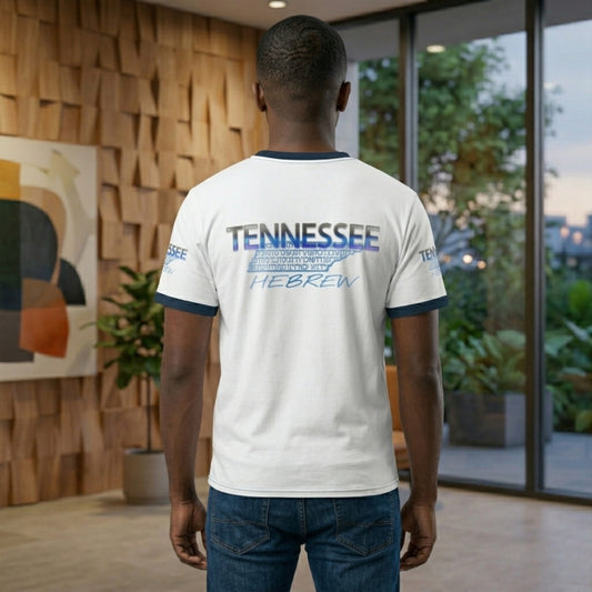
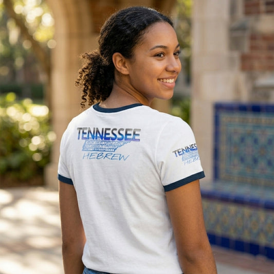
Chrome & Liquid Metal Finish: The typography and the state outline of Tennessee feature a highly reflective, "wet-look" chrome finish. This gives the design a tangible, weighted feel—as if the logos were cast from solid cobalt or gold.
-
Beveled Dimensionality: Each element uses sharp, calculated bevels and 3D embossing. This creates a sense of physical relief, making the "Tennessee" and "Hebrew" text pop against the intricate, map-like background.
-
Gradient Fusion:
- The Cobalt version uses a sophisticated blue-to-silver gradient, mimicking the cooling of tempered steel.
- The Gold version utilizes a warm yellow-to-forest-green gradient, suggesting an oxidized or "living" precious metal.
-
Typographic Layering: The design layers clean, bold Western sans-serif block lettering over a dense, intricate background of Hebrew script. This creates a "Scripted Stillness" effect—where the complexity of the ancient letters serves as a foundational texture for the bold modern title.
-
Symmetry and Silhouette: By containing the detailed script within the geographical silhouette of Tennessee, the style bridges regional pride with deep ancestral identity through a clean, recognizable vector shape.
Structural & Linguistic Mechanics: The Architecture of the Script
Taking a strictly linguistic and structural approach to the Hebrew language and the physical geometry of the design, the work can be interpreted through the mechanics of the script and its historical development.
1. The Anatomy of the Script
The text within the map is rendered in Square Script (Aramaic-Hebrew), which evolved from the Paleo-Hebrew alphabet. Unlike Latin characters which are often rounded, Hebrew is architecturally "top-heavy."
-
Horizontal Alignment: Most Hebrew letters are defined by their horizontal top strokes (the "roof"). This creates a visual ceiling within the Tennessee border, emphasizing a sense of structural stability.
-
The "Gematria" of Form: Even without assigning numerical values, the complexity of the characters contrasts with the simple, straight lines of Tennessee's northern and southern borders. The letters act as a "texture" that fills a void, transforming a geographic outline into a container for information.
2. Textual Density and "Sofer" Craft
The way the letters are packed into the state's silhouette mirrors the technique of a Sofer (Scribe).
-
Justification: In traditional Hebrew manuscripts, letters were often stretched or compressed to ensure the text reached the edge of the margin without leaving white space.
-
The "Block" Aesthetic: By filling the map entirely, the design treats the geography of Tennessee as a parchment. The letters aren't just labels; they are the physical substance that gives the map its weight.
3. Phonetic and Visual Contrast
The design creates a sharp distinction between the Phonetic (top/bottom) and the Symbolic (middle).
-
Linear vs. Non-Linear: The English words "TENNESSEE" and "HEBREW" follow a standard linear reading path. However, the Hebrew letters inside the map are non-linear; they are fragmented and layered. This forces the eye to stop "reading" and start "observing" the shapes as a singular graphic unit.
-
The "Kuv" (Line) and the "Nekudah" (Point): In Hebrew grammar and orthography, the relationship between lines and points is essential. The chrome and gold gradients highlight the "thorns" (the small decorative strokes on the tips of the letters), showcasing the precision of the character set.
4. Metallurgical Symbolism
The choice of gold and blue-silver (chrome) finishes relates to the historical descriptions of the Tools of the Tabernacle (the Kelim), viewed strictly as a matter of craftsmanship and material science:
Part 01-01: The Gilded Ore
(The gold and olive/green design)
-
Visual Narrative: This part represents the "Timeless" or "Organic" side of the foundation. The gold evokes a sense of refined heritage and value that has been "unearthed" within the state's borders.
Part 01-02: The Cobalt Alloy
(The blue and silver/chrome design)
-
Visual Narrative: This part represents the "Cool" or "Modern" side of the foundation. The chrome highlights suggest the industrial strength and the "living" nature of the language.