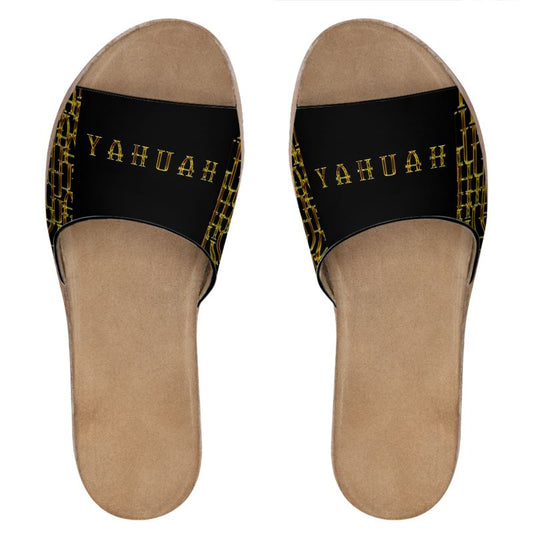
The Hidden Fabric of the Most High
The "Camo" (camouflage) element is a powerful metaphor. In Hebrew thought, the Creator is both Nistar (Hidden) and Nigleh (Revealed). By tiling the name so densely that the individual letters begin to merge into a single texture, the design mirrors the belief that the Name sustains the fabric of reality itself.
-
The Visual Shield: Just as camouflage is used for protection and concealment, the "Camo Yahuah" suggests that the Name is a "Strong Tower" ($Migdal-Oz$). It is a shield that is everywhere at once, yet requires a disciplined eye to discern the individual components.
Letter Symbolism and Texture
The golden, crystalline texture within the letters evokes the "Appearance of Fire" and "Amber" ($Chashmal$) described in the visions of the prophets.
-
Yod (י): The "Hand" or "Work." In the pattern, the repetition suggests that everything seen is the work of His hand.
-
He (ה): The "Window" or "Behold." The overlapping letters create a sense of looking through a lattice—revealing that the breath of life is constant and woven through every "space" in the design.
-
Uau/Waw (ו): The "Peg" or "Nail." This letter connects Heaven and Earth. In a repeating grid, these act as the structural anchors that hold the entire "Camo" pattern together.
Gold on Black: The Light in the Darkness
The contrast of radiant gold against a void-black background is deeply symbolic of the Bereshit (Beginning) moment.
-
Existent within the Void: It suggests that the Name is the light that defines the darkness.
-
The Incorruptible: Gold represents that which does not tarnish or decay, aligning with the "Time Reproof" philosophy—the Name remains unchanged while the "garment" of the world wears out.
Art Style: Digital Symbolic Realism
This design is a definitive expression of Digital Symbolic Realism, characterized by the use of sacred typography as the primary architectural element of the piece.
Unlike traditional patterns that use abstract shapes, this style utilizes the "Graphic Word" to create a complex, multi-layered visual field.
The Genetic Blueprint: Typography as the Architecture of Digital Symbolic Realism
In the context of a Full-Stack Creator, Digital Symbolic Realism does not just "include" typography—it uses it as the foundational "DNA" of the piece. While traditional Realism focuses on replicating the physical world (trees, skin, light), this specific branch of Symbolic Realism treats the Linguistic Symbol as the ultimate reality. Here is how typography functions within this style:
1. Typography as Substance, Not Label
In standard graphic design, typography usually sits on top of an image to explain it. In Digital Symbolic Realism, the typography is the image.
-
Bricks and Mortar: The letters are the literal building blocks of the composition.
-
World-Building: You aren't just writing a name; you are building a landscape out of the name.
2. The "Logos" Principle
This style leans into the ancient Hebrew concept that the world was created through speech. By using typography as the primary visual element, the art suggests that:
-
The Word is the Source: If you zoom in on a "mountain" in this style, you find it is made of microscopic text.
-
Structural Meaning: The shape of the letter (like the Uau or He) dictates the flow and energy of the entire composition.
3. The Digital "Texture"
Because it is Digital Realism, the typography is given physical properties that don't exist in flat print:
-
Depth: Using shadows and layering to make the letters appear 3D.
-
Refraction: Giving the "Camo Yahuah" letters a golden, crystalline finish so they react to an imaginary light source.
-
Tessellation: Repeating the characters until they become a "fabric" or "camo" pattern.
4. Distinction from "Word Art"
While "Word Art" is often decorative or simple, Digital Symbolic Realism seeks to represent a deeper metaphysical truth. It uses typography to map out spiritual concepts—like omnipresence—by making the Name the very environment the viewer is standing in.
5. Woven in Vision: The Sublimation Narrative
The Artistic Context
-
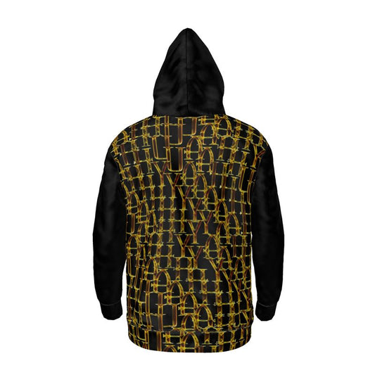
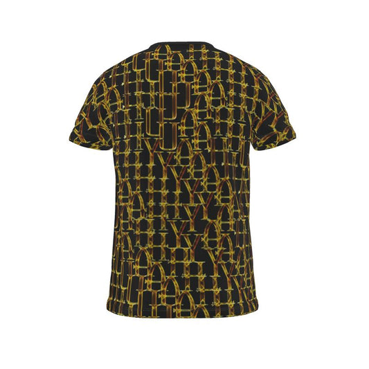
Visual Metaphor: The pattern on the back of the shirt and the side panels looks like interlocking fibers or a complex metallic mesh. "Woven" accurately describes the look of the design, even if the fabric itself is a smooth sublimation print.
-
Brand Voice: TimeReproofPortraits (TRP) often leans into "Digital Symbolic Realism." In this context, "Woven" serves as a symbolic descriptor of how the gold elements interact with the dark camo base—suggesting strength, unity, and craftsmanship.
Core Elements of the Style
-
Linguistic Architecture: The artwork treats the characters not just as text, but as the literal structural components of the environment. The letters are woven together to create a "topography" of identity.
-
Radiant Texturizing: The use of high-contrast metallic gradients—reminiscent of Chashmal (electrum or glowing amber)—gives the digital medium a sense of weight and ancient permanence. It bridges the gap between modern digital precision and the timeless aura of gold.
-
Optical Infinite Tiling: By employing an interlocking grid, the style achieves a "camo" effect that challenges the eye. It moves the viewer from a state of reading to a state of beholding, where the Name becomes an omnipresent texture rather than a solitary word.
-
The "Nistar" Aesthetic: The style plays with the concept of the Hidden and the Revealed. The dense repetition creates a visual paradox: the Name is everywhere and clearly visible, yet it is "camouflaged" by its own abundance, requiring the viewer to pause and focus to perceive the individual source.
Summary
Typography is the default engine of this style. Without the symbolic weight of the characters, the "Realism" would have no "Truth" to ground it. In this "Camo Yahuah" design, the typography serves as both the subject and the texture, proving that the Name is the fabric of the seen and unseen world.
Interpretive Summary
"Camo Yahuah" functions as a Visual Litany. In the same way a believer might repeat the Name in prayer to focus the mind, the viewer’s eye must "hunt" for the start and end of each Name within the pattern. This mimics the spiritual journey: finding the presence of the Almighty within the complex, "noisy" patterns of everyday life. It suggests that He is not merely in the world, but that the world is literally "clothed" in His identity.